The role of the axes
Consider the two visualisations below, is there a significant difference?


The two charts are made from the same data series, the only difference is that in the first case we truncated the y-axis, so the small differences appear significant. When making visualisations, try to ensure that both the minimum and maximum values appear on the y-axis and that the scale is not unnecessarily long (this could create a “reverse” effect, as larger differences would also appear smaller). If truncation is justified, it should be clearly indicated. If a logarithmic scale is used, it should also be marked accordingly.
Correlation vs causation
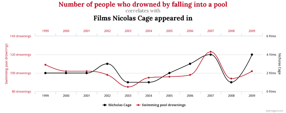
Is there a relationship between the following two datasets?

The figure shows that the two data series are correlated, but the correlation does not imply causality. In most cases, there is a “confounding variable” in the background causing the correlation that we don’t even know about.
Pie charts and 3D diagrams
Pie charts and other distribution plots should only be used if the data plotted amount to 100%, with each observation unit falling into a single category. So for example, when visualizing questionnaire results, pie charts are only appropriate if the respondents can give only one answer each. If there are numerous categories in the chart, is can be difficult to see the differences, so use a tree diagram instead. If you want to show the differences between categories, you should also show the percentages in the graph.
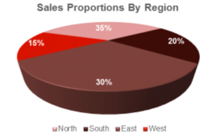
Avoid using three-dimensional figures as they can be very misleading. Consider the example below:

Due to distortion, at first glance the figure does not suggest what the data do (see “North” and “East” values). In other 3D figures, the data may also obscure each other, so be careful or simply avoid them and use 2D versions instead.
Cumulative data
When using cumulative way of plotting, it is important to indicate it in the proper way. However, before creating these diagrams, think about whether there is any added value or not. Simply think about Tim Cook and iPhone sales. Can we extract any information from his chart?
Map visualisations with inappropriate colouring
When using cartograms, pay attention to the choice of colours. If the data on which you are colouring can be measured on ordinal scale at least, make sure that the colouring reflects this, rather than using a patchwork of colours, so that you can produce a more easily interpretable representation.
Data visualisation has a lot of creative potential, but always be careful of what you want to communicate with the graph, choose the right graph for the data, and never put appearance before clarity and interpretability.
